Google has started to highlight the bloggers
with the Mobile friendly tag. The tag is given to the blogger/websites which
are mobile friendly and are supported to the iPhone, android etc. when the
blogger/websites are Mobile friendly than they can easily be open on the mobiles,
tabs, iPhone etc. my site has passed and got the tag from Google and its
highlighted from Google in grey color as Mobile friendly. The tag is given to
the Responsive Blogger Templates; the templates which adjust themselves
according to the width of the android, tabs etc. screen sizes are called Responsive
Blogger Templates.
How to Test your blog/site for Mobile Friendly Tag
If you want to check either your
blogger/website passes the Mobile friendly test of Google or not. Or to check
either your blogger/website template is Mobile Responsive or not than check it out here. If you
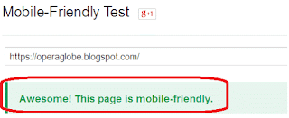
have applied Responsive Blogger Template then it will be shown like this.
If unfortunately you have not gone through Responsive
Blogger Templates then results will be as:
How to make Responsive Blogger Templates
Step 1
- 1- Go to blogger dashboard > Template
- 2- On mobile view > click on setting gear
- 3- By default it shows the first option selected
- 4- You have to choose and mark the second option; No, show desktop template on mobile device > Save
- 5- Now it will disable the mobile view.
Step 2
- 1- Now go to Template > Live on blog > edit HTML
- 2- Search for <head>
Add this code just below <head>
<meta name="viewport" content="width=device-width, initial-scale=1, maximum-scale=1"/>
- 3- Now search for ]]></b:skin>
Add this code just above ]]></b:skin>
That’s it. Now Save.
/* ######## Responsive Blogger Template ########### */
/*-----iPhone 2G, 3G, 4G, 4, 4S Portrait View Z1 ----------*/
@media only screen and (max-width:320px) {
}
/*-----iPhone 2G, 3G, 4G, 4, 4S Landscape View Z2 ----------*/
@media only screen and (max-width:480px) {
}
/*-----iPhone 5, 6 View Z3 ----------*/
@media only screen and (max-width:568px) {
}
/*-----iPads Tablets Z4 ----------*/
@media only screen and (max-width:768px) {
}
That’s it. Now Save.
How to hide objects on Mobile view
In case, if you want to hide any object in mobile view; use the
following coding.
.classname{display:none}OR#idname{display:none}
In the above coding (.) dot shows the HTML and (#) hash is used for ids.
How to show Related Post widget on Mobile View
Go to Template > search for Related Post widget
Just below the title of Related Post; paste
this code
mobile='yes'
Confirm the settings are applied correctly
If you want to check that how your blogger/website looks like on Mobile
view or your blogger/website became Mobile friendly go there Test Mobile Friendly Blogger/website. If you gona check that after applying the above settings
you have Responsive Blogger Template; check here mobiletest.me. If this article has become knowledgeable and helpful to you then don’t
forget to comment below or share us on social media.


No comments:
Post a Comment
Thanks for being the part of our community :)